


You’ve spent hours searching for the perfect paint color. You found a beautiful shade of gray on Pinterest, fell in love with a warm white in your friend’s living room, or picked out a beige that looked absolutely perfect on a paint swatch.
But when that same color goes on your walls, something isn’t right.
The gray looks blue. The white looks yellow. The beige suddenly has a pinkish tint you never noticed before.
What happened?
The answer is simple: Paint color doesn’t exist in isolation. It interacts with everything around it.
At My Three Sons Professional Painting & Remodeling, we’ve spent years helping homeowners throughout Lexington and Central Kentucky transform their homes with beautiful, professionally applied finishes. One of the most important lessons we’ve learned is that choosing the right paint color involves much more than selecting a shade you love.
Let’s explore why the same paint color can look dramatically different from one room to another—and how to avoid making an expensive color mistake.
1. Natural Light Changes Everything
Natural light is one of the biggest factors affecting how paint colors appear.
A color that looks warm and inviting in the morning might appear cooler or more muted by late afternoon. The paint hasn’t changed, but the light illuminating it has.
Consider how a single room changes throughout the day:
- Morning: Depending on the direction of the windows, light may be soft, cool, or warmly golden.
- Midday: Stronger daylight can make colors appear brighter and reveal undertones you hadn’t noticed.
- Late afternoon: Lower-angle sunlight often creates a warmer appearance in rooms receiving direct sun.
- Evening: As daylight fades, artificial lighting becomes the dominant influence on your wall colors.
Even the weather and seasons matter. A cloudy or cold Kentucky winter afternoon produces a very different quality of light than a bright, sunny summer day.
That’s why we encourage homeowners to evaluate paint colors at several different times of day before making a final decision.
A color that looks perfect at 10 a.m. Natural light is one of the biggest factors affecting how paint colors appear.
2. The Direction Your Windows Face Matters
North-facing rooms
These rooms typically receive cooler, indirect daylight in the Northern Hemisphere. Some whites and grays may appear bluer or more subdued.
South-facing rooms
Often receive abundant, relatively warm daylight. Colors may appear brighter and warmer, especially during sunny periods.
East-facing rooms
Receive direct morning sunlight but often become cooler and more subdued later in the day.
West-facing rooms
May appear relatively cool in the morning but become dramatically warmer when afternoon sunlight streams through the windows.
Of course, window size, landscaping, roof overhangs, neighboring buildings, and even window treatments can influence these effects.
A north-facing room with enormous windows may receive more usable daylight than a south-facing room shaded by mature trees.
Our advice: Don’t choose a color based solely on how it looks in another home. Evaluate it in the actual room where it will be used.
3. Your Lightbulbs Can Completely Change a Paint Color
Have you ever loved a paint color during the day, only to turn on the lights at night and wonder what happened?
Your lightbulbs may be responsible.
Artificial lighting varies significantly in color temperature, which is measured in Kelvin (K).
Here’s a practical guide:
| Color temperature | Typical appearance |
| 2700K | Warm, yellowish light |
| 3000K | Warm white |
| 3500K | Neutral to slightly warm |
| 4000K | Cooler, neutral white |
| 5000K | Daylight-like, often bluish by comparison |
A warm white paint under a 2700K bulb may look creamy or yellowish. Under a 4000K bulb, that same paint may appear cleaner or cooler.
Color rendering matters, too. Two bulbs with the same Kelvin rating can reproduce paint colors differently. Look for bulbs with a high Color Rendering Index (CRI), preferably 90 or higher, when accurate color appearance is important.
We recommend evaluating your paint samples under the lighting you actually intend to use.
If you plan to replace your light fixtures or bulbs during a renovation, make those decisions before finalizing your wall color. Otherwise, you may choose the perfect color for lighting that won’t exist when the project is finished.
4. The Hidden Undertones in Neutral Paint Colors
This is where choosing paint colors can become particularly frustrating.
You might think you’re choosing a simple white, gray, or beige. But many neutral paint colors have subtle undertones that become more noticeable under certain lighting conditions or next to other colors.
For example:
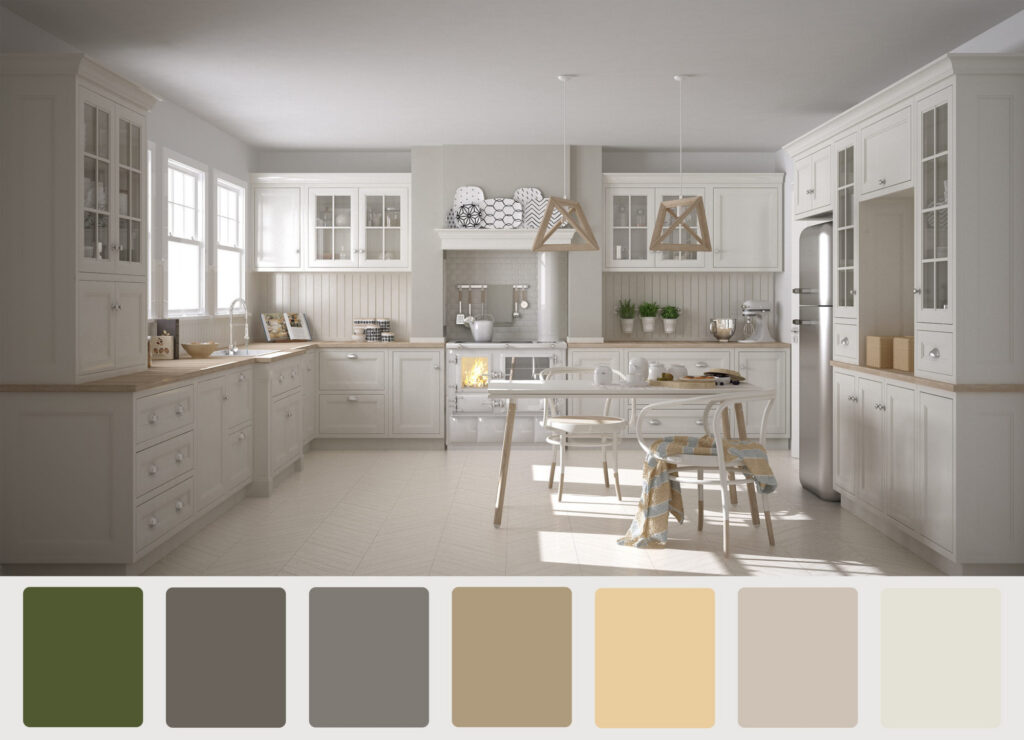
White paint may have yellow, pink, green, blue, or gray undertones.
Gray paint may lean blue, green, violet, or brown.
Beige paint may have pink, yellow, orange, or green undertones.
Greige paint, a combination of gray and beige, can appear warmer or cooler depending on its formulation and surroundings.
Imagine selecting a beautiful warm gray for your living room. On the paint chip, it looks perfectly neutral.
But once applied next to your warm oak flooring, the gray suddenly appears slightly purple.
The flooring didn’t change the paint’s actual color. It changed how your eyes perceive that color in context.
This is one reason professional color guidance can be so valuable.
An experienced painting professional can help identify potential undertone conflicts before you commit to painting an entire room.
5. Your Flooring, Cabinets, Countertops, and Furniture Influence Wall Color
Every room contains colors that influence how your wall paint appears.
Consider a kitchen with warm oak cabinets, honey-colored hardwood flooring, and a creamy beige countertop.
A cool gray wall color might look beautiful on its own but feel disconnected from those warmer finishes.
Now imagine the same gray in a kitchen with white quartz countertops, charcoal cabinetry, and cool-toned tile.
The overall effect could be completely different.
The same principle applies to:
- Hardwood and luxury vinyl plank (LVP) flooring
- Kitchen and bathroom cabinetry
- Granite, quartz, and marble countertops
- Backsplash tile
- Upholstered furniture and area rugs
- Window treatments and wood trim
Large surfaces are especially influential because they occupy so much of your visual field.
Reflected light can also contribute. Sunlight bouncing off a green lawn, red brick patio, or neighboring exterior wall can introduce a subtle color cast into a room.
A helpful rule: Choose your paint color with the room’s permanent elements in mind.
Flooring, cabinetry, countertops, and tile are generally much more expensive to change than paint.
Your wall color should work with those elements rather than compete with them.
6. Paint Sheen Can Change How a Color Appears
Most homeowners focus on choosing the right color, but the paint’s sheen deserves attention, too.
Paint sheen refers to how much light the finished surface reflects.
Common options include flat, matte, eggshell, satin, semi-gloss, and gloss, although terminology and sheen levels vary by manufacturer and product line.
Generally speaking:
| Sheen | Visual characteristics |
| Flat or matte | Minimal reflection; helps disguise minor wall imperfections |
| Eggshell | Soft, subtle sheen |
| Satin | Noticeable reflection, particularly in angled light |
| Semi-gloss | More pronounced highlights and reflections |
| Gloss | Highly reflective appearance |
Higher-sheen finishes can create brighter highlights and make the same color appear different from a flatter finish, particularly when viewed from an angle.
Surface texture and paint formulation also influence the final appearance.
This is why a color on a flat-finish sample board may not look identical when applied in satin.
When testing paint colors, try to use the actual product and sheen you plan to use for the finished project.
7. Small Paint Swatches Can Be Misleading
A two-inch paint chip simply cannot tell you everything you need to know about how a color will look across a twelve-foot wall.
Small samples sit next to other colors, often including the existing wall color. That surrounding color can distort how you perceive the sample.
When the entire wall is painted, the visual relationship changes.
A color that looked pleasantly bold on a small swatch might feel overwhelming across four walls. A subtle neutral may reveal an unexpected undertone when it covers a large area.
That’s why we recommend testing larger samples before committing.

Our recommended paint-testing process
The My Three Sons Color-Testing Checklist
- Reset
- Narrow your choices to two or three promising colors.
- Apply large samples, ideally approximately 2 feet by 2 feet, using two coats or enough to achieve full coverage.
- Test the colors on more than one wall, especially walls receiving different amounts of light.
- Keep samples away from each other when possible, so adjacent colors don’t distort your perception.
- Evaluate each color in the morning, afternoon, and evening.
- Turn on your normal room lighting and evaluate the colors again.
- View the samples next to your flooring, cabinets, countertops, and trim.
- Use the intended paint product and sheen for the most representative test.
If you prefer not to paint samples directly onto your walls, large movable sample boards are another excellent option. They allow you to evaluate the same color in several locations without covering your walls with test patches.
Just remember that peel-and-stick color samples may not reproduce the exact appearance of your final paint product and sheen.
The goal is to see how the color behaves in your home, not simply how it looks on a tiny chip at the paint store.
8. Why Online Paint Colors and Digital Renderings Aren’t Exact Matches
Online inspiration is a wonderful starting point.
Paint manufacturers offer digital color tools, and professional and AI visualizations can help homeowners imagine how a room might look after a transformation.
However, a digital image doesn’t guarantee exact color reproduction.
Your computer or phone screen has its own brightness, color settings, and display characteristics. Photographs are also affected by camera settings, lighting, and editing.
At My Three Sons, we use custom AI visualizations to help customers envision certain painting and remodeling projects before the work begins.
These visualizations can be extremely helpful for comparing design options and understanding how different colors might work together.
But we always want homeowners to understand that a digital rendering is a design aid, not a substitute for evaluating actual paint samples in the space.
Base the final decision on real paint under real lighting conditions.
9. Professional Color Guidance Can Help Prevent an Expensive Repaint
Painting an entire home represents a meaningful investment.
The last thing you want is to spend thousands of dollars transforming your interior, only to discover that the color you selected doesn’t look the way you imagined.
Repainting means purchasing additional materials, paying for more labor, and potentially disrupting your household all over again.
Professional guidance can help reduce that risk.
An experienced painting or professional can help you evaluate lighting conditions, identify undertones, consider existing finishes, select appropriate sheens, and establish a practical testing process.
For larger projects, working with a professional color consultant or interior designer may also be worthwhile.
No one can guarantee that every homeowner will perceive a color exactly the same way. Color is personal, and individual preferences matter.
But thoughtful planning and proper testing can dramatically reduce unpleasant surprises.
Our goal at My Three Sons is to help you make confident, informed decisions before we paint the first full wall.
The Bottom Line: Test the Color in Your Home, Not Someone Else’s
The same paint color can look beautiful in one room and completely different in another.
Natural light, window direction, artificial lighting, undertones, surrounding finishes, and paint sheen all influence the final appearance.
Before committing to a color, take the time to test it properly.
And remember: A paint color doesn’t have to look exactly like it did in a photograph or someone else’s home to be the right choice for yours.
It needs to look beautiful in your space, with your lighting, your furnishings, and your personal style.
That’s what matters.
Ready to Transform Your Home? Let’s Get the Color Right.
At My Three Sons Professional Painting & Remodeling, we help homeowners throughout Lexington and Central Kentucky create beautiful spaces with professional interior painting, careful preparation, and exceptional craftsmanship.
Whether you’re refreshing a single room or repainting your entire home, we’d love to help you bring your vision to life.
We believe every project is an opportunity to earn trust, do exceptional work, and leave both our customers and our own people better than we found them.